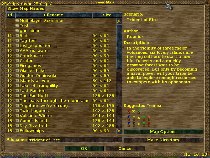
Topic: Load map/ Save Map UI
|
kaputtnik |
Posted at: 2015-03-11, 17:10
if the button is still too bright, let me know.
You meant the "suggested teams" tab? I don't have an idea for a graphic. It should be imho like the button in the editor for placing the players.  Top
Top
 Quote
Quote
|
|
GunChleoc Topic Opener |
Posted at: 2015-03-12, 15:23
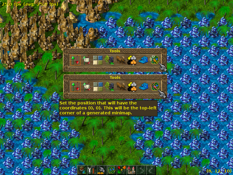
No, I mean "Set origin" - I recycled the Players graphic for the Suggested Teams - great minds think alike Busy indexing nil values  Top
Top
 Quote
Quote
|
einstein13
|
Posted at: 2015-03-12, 17:32
I have one question: is it possible to make two buttons:
? Or you think that it is too many buttons? Edited: 2015-03-12, 17:32
einstein13  Top
Top
 Quote
Quote
|
|
kaputtnik |
Posted at: 2015-03-12, 18:19
Just a quick work: Edited: 2015-03-12, 18:24
 Top
Top
 Quote
Quote
|
|
GunChleoc Topic Opener |
Posted at: 2015-03-13, 10:08
Here are the new graphics in context. The 0's in the Set Origin tool get cropped while hovering over the graphic, so it still needs some work. Busy indexing nil values  Top
Top
 Quote
Quote
|
einstein13
|
Posted at: 2015-03-13, 12:57
With this explanation it is ok to keep only one button: set origin. If we have two images to choose, first one (brighter) is visible to me. Second - not. einstein13  Top
Top
 Quote
Quote
|
|
kaputtnik |
Posted at: 2015-03-13, 19:16
Sorry, try one of this: Should the yellow arrow also be white if this one is choosen?  Top
Top
 Quote
Quote
|
|
GunChleoc Topic Opener |
Posted at: 2015-03-15, 21:11
I think leaving the yellow arrow yellow will be better, because this is the color it generally has in the user interface. Busy indexing nil values  Top
Top
 Quote
Quote
|


