Topic: New resource indicators
|
kaputtnik Topic Opener |
Posted at: 2016-01-10, 17:10
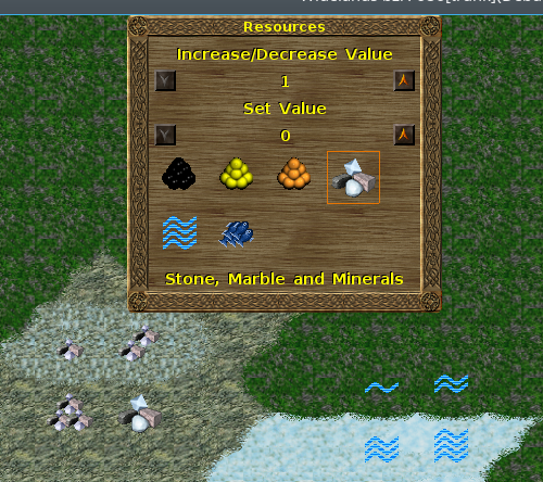
Water resource has currently only one image for indicating water on the map in editor, while other resources have 4 different images showing the amount of ore/fish/stone. Resource "stone" is is handled different in each tribe, f.e. atlantean mines granite, quartz and diamonds from this resource and Empire mines granite and marble. I thought these differences should be reflected when using the "Set resource" tool, so that a map maker could imagine that the resource "stone" is for different resources. Here are some examples, showing different images for water and stone resource: Water: Water and Stone 1: Water and Stone 2: What do you think?  Top
Top
 Quote
Quote
|
|
Dishito |
Posted at: 2016-01-10, 18:14
I like the buckets for the water, but I prefer the second example for the stone.  Top
Top
 Quote
Quote
|
|
wl-zocker |
Posted at: 2016-01-10, 20:43
I don't like either water image. The waves look very meaningless. The buckets are human-made and do not find into the image of creating a world with its natural resources. For the stones, it's difficult to say. I prefer the big image from stone2. But the smaller images can be hard to say on some terrains, I think. I dislike a pile of resources like the stone1, but it is better visible than stone2. I think it is great that you try to improve the graphics of Widelands. But in this case, I wonder whether this is really necessary. The old icons are very clear (many balls = much resources) and easy to distinguish from each other (different colors) and the background terrains. Regarding your motivation from the bug report:
I do not know if it really helps to show all of them. For the other resources, we only show abstract images, too; which is fine. I think changing the tooltip (as I see you have done) is enough to make it clear to the map-maker what this resource is. "Only few people know how much one has to know in order to know how little one knows." - Werner Heisenberg  Top
Top
 Quote
Quote
|
|
Tibor |
Posted at: 2016-01-10, 21:58
I am quite satisfied with current indicators too.  Top
Top
 Quote
Quote
|
|
Vassili |
Posted at: 2016-01-10, 22:07
Idem of Dishito post.  Top
Top
 Quote
Quote
|
|
kaputtnik Topic Opener |
Posted at: 2016-01-10, 22:24
The only reason for changing this was that there was only one indicator image for water. One couldn't see on the map if there is much water or less water placed. Of course i could only add the missing images for water (less to many blue balls). On the other side i think it would help beginners if there is some conclusion from game to map. So buckets come into my mind to show resource water. But the help text may also help to abstract this conclusion. For the stones the text on the bottom may is enough for help.  Top
Top
 Quote
Quote
|
king_of_nowhere
|
Posted at: 2016-01-10, 22:24
i agree with wl-zocker. I prefer clarity over fancy graphics.  Top
Top
 Quote
Quote
|
|
GunChleoc |
Posted at: 2016-01-11, 13:01
I also think sticking wi the balls will work better for the map overlays. Alternatively, we could have something that looks like the resource indicators that the geologists will place in-game, e.g. a bunch of 1-4 resource indicators. Busy indexing nil values  Top
Top
 Quote
Quote
|
DragonAtma
|
Posted at: 2016-01-11, 15:51
I agree with using balls for stone. Keep in mind that different stone preferences means that different results for different tribes; a spot may give 6 stone to Barbarians, while it'd instead give 2 stone, 2 diamonds, and 2 quartz to the Atlanteans.
 Top
Top
 Quote
Quote
|
|
kaputtnik Topic Opener |
Posted at: 2016-01-11, 18:40
Then setting different amount of water (with in/decrease buttons) wouldn't make sense. I am not sure, but i believe if there is less water in one spot, the chances to pull water is also lesser. SirVer explained it somewhere, but i couldn't find the post I make 3 "ball" images for water, like the ore resources have. And leave stone as it is. Thanks for your posts  Top
Top
 Quote
Quote
|


