Topic: Tabbed profile page
|
kaputtnik Topic Opener |
Posted at: 2017-12-26, 12:25
I am thinking for years about to make the login box smaller to have some place on the top for other things. The main idea is to move some links from the login box into tabs on the profile page. The login box contains then only "Login/Register" if one isn't logged in, and "Your Profile ( x ) Logout" when logged in. "Your Profile" is the link to your profile page where you can edit your settings, "x" is the the number of PMs and on a click on that number you get to the messages page. I did some work already but running out of ideas how to design the donate and social media boxes on the top. Currently: Any ideas?  Top
Top
 Quote
Quote
|
|
kaputtnik Topic Opener |
Posted at: 2017-12-26, 22:42
Another attempt:  Top
Top
 Quote
Quote
|
|
trimard |
Posted at: 2017-12-27, 09:31
Mhhhh... don't know if I already talked about that but this reflexion really needs to be thought in regard to the future responsive design of the general website! And for that matter the easiest way would be to have a sort of second menu. Would that be possible to take the second attempt and put them in the same box with some sort of separator? I guess even a simple line would be enough at first? +1 for the maps and donate icons +1 for the background color in the second attempt +1 for the tab profile (maybe remove the shadows though? To differentiate between selected and not select I think a change of text color would be more suited? To test, I'm not sure ) edit: oh! And maybe add a message icon close to "your profile" the number alone is weird. Logout could be replaced with an icon too btw, but not sure how that would render in the end. Edited: 2017-12-27, 09:35
 Top
Top
 Quote
Quote
|
|
kaputtnik Topic Opener |
Posted at: 2017-12-27, 12:45
Yes, i tried that by using a flex design.
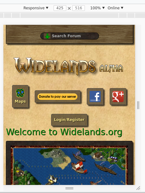
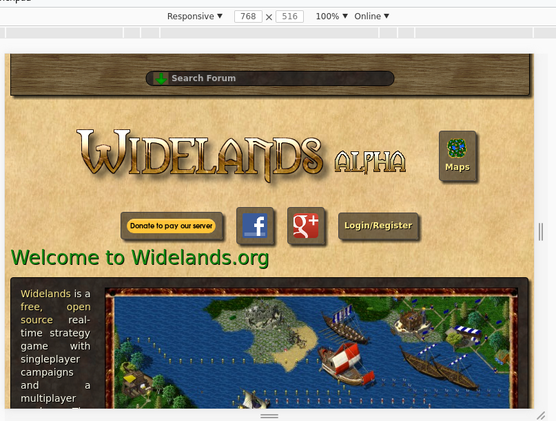
Don't know exactly what you mean here. I have tried to merge this in you responsive branch and with some adjustments it looks this way:
I think the entries in the top 'menu' should all have the same height. And it would be better to make them in one block so the logo and the 'menu' stays on its own rows when the viewport shrinks. I guess you mean that?
The donate button could be adjusted further to contain two lines of text.
I am not very confident with that, but better as the first attempt
The shadow is removed on a selected item. Additionally it get removed when hovering over the tabs. I like it, but i am open for other ideas  Top
Top
 Quote
Quote
|
|
kaputtnik Topic Opener |
Posted at: 2017-12-27, 22:49
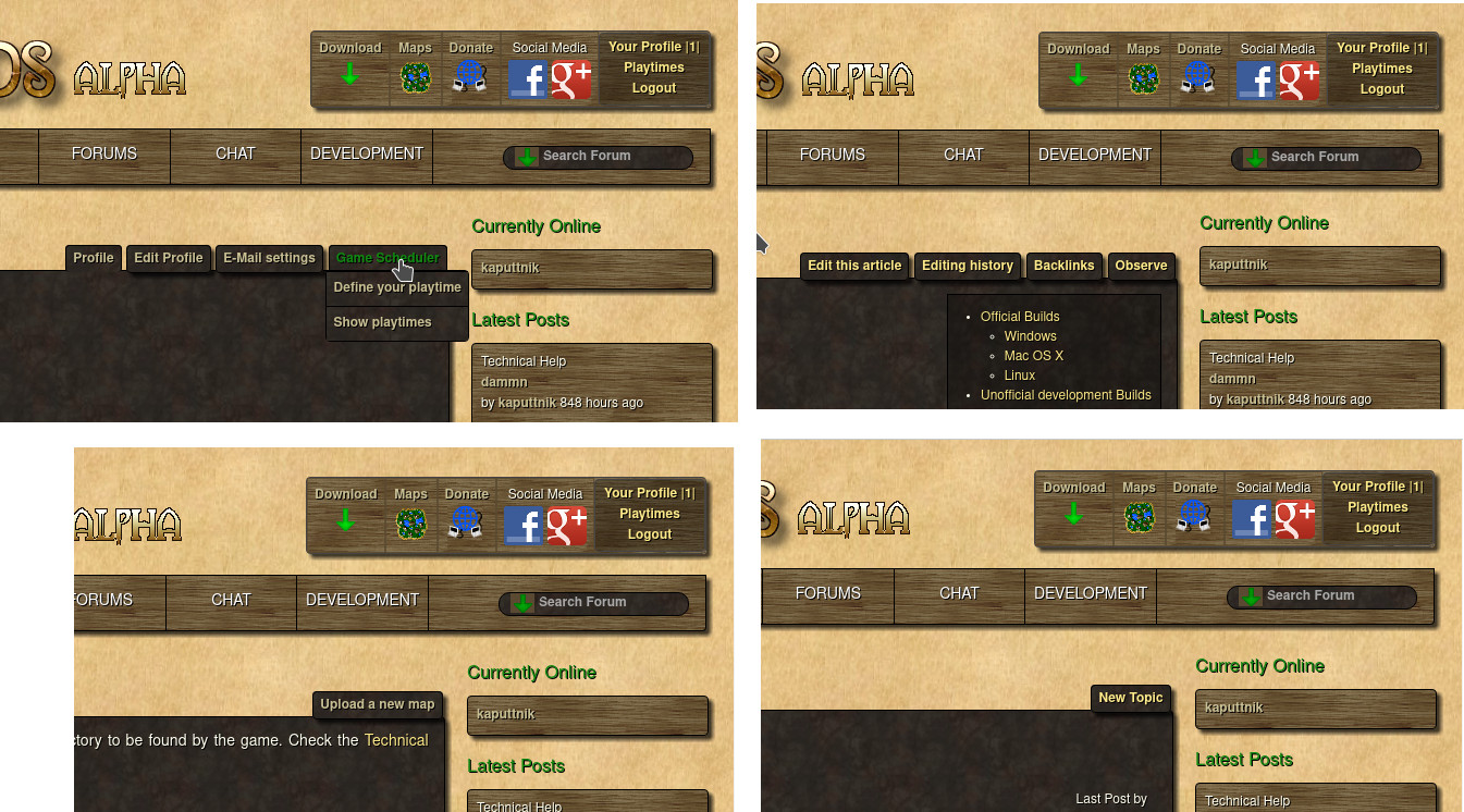
Actual state: The header is splitted into two sections 'logo' and the 'menu' on the right. As soon the browsers window get smaller and the right 'menu' does not fit anymore onto the right of the 'logo' it is moved below the logo and all sections are placed centered: I have added an additional link to the download page in the wiki . The bottom screenshot shows also the tooltip when one is hovering over the text 'Your Profile'. Edited: 2017-12-27, 22:54
 Top
Top
 Quote
Quote
|
|
kaputtnik Topic Opener |
Posted at: 2018-03-11, 21:53
An actual image which shows some changes made so far. Tabs are added to Wiki, Maps, Forum and all other places where currently small green links are shown (e.g. in in Maps: "Upload new map". Any remarks?  Top
Top
 Quote
Quote
|
|
trimard |
Posted at: 2018-03-12, 21:24
Verrryy cool! Nice touch with the donate icon. I tried looking for one, but I couldn't imagine one that would fit. +1 for putting titles for every icons! (Although maybe change the look of the title of social medias so it's the same as others?) I'm still having a problem with the last tab not being aligned with the big box. Is that by design for more clarity though?  Top
Top
 Quote
Quote
|
|
kaputtnik Topic Opener |
Posted at: 2018-03-13, 08:07
Thanks
I am not really happy with color of the globe ...
Clash of function vs. visual style here:
To be honest this was random  Top
Top
 Quote
Quote
|
|
kaputtnik Topic Opener |
Posted at: 2018-11-12, 21:06
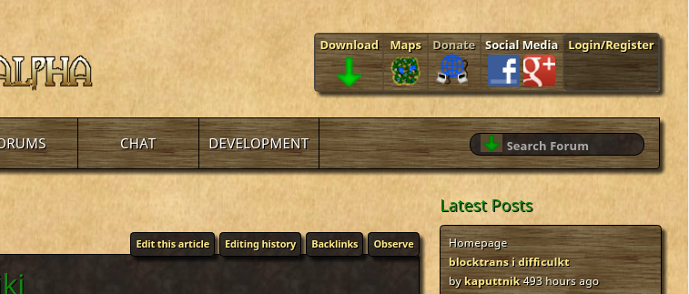
As you might have noticed, the changes are in right now. Feel free to make suggestions how to improve the new design If your browser doesn't show the page as like shown in the previous images, please post your used browser and the version.  Top
Top
 Quote
Quote
|


 But i like it. Right aligned with the big box does not look better, imho: