


Topic: Coat of Arms: Barbarians
|
fraang Topic Opener
Joined: 2010-02-15, 13:13
Posts: 239  Widelands-Forum-Junkie |
Posted at: 2010-12-27, 16:52
Do you mean a coloring like this:
 Top
Top
 Quote
Quote
|
chuckw
Joined: 2010-03-15, 16:23
Posts: 945  One Elder of Players Location: New York - USA |
Posted at: 2010-12-27, 18:12
Yes. Something along that line, incorporating the letters of the icon into the logo. I see little people.
Top
Quote
|
|
fraang Topic Opener
Joined: 2010-02-15, 13:13
Posts: 239 Widelands-Forum-Junkie |
Posted at: 2010-12-27, 18:27
Ok. Maybe we/I should write a style/logo guideline for Widelands where for example the color codes are defined. Here an rough scratch: Widelands green: HTML notation: 388020 Red: 56 Green: 128 Blue: 32 Widelands brown: HTML notation: 803820 Red: 128 Green: 56 Blue: 32 Widelands gold: HTML notation: c09438 Red: 192 Green: 148 Blue: 56
Top
Quote
|
|
chuckw
Joined: 2010-03-15, 16:23
Posts: 945 One Elder of Players Location: New York - USA |
Posted at: 2010-12-27, 18:37
That is an excellent idea. It would help graphic artists (myself especially) maintain a consistent look throughout the project (i.e. game, editor and website). If you would care to create a catalog of the color codes we currently utilize in our standard graphics, that would be very much appreciated. We can discuss at a later time how and where that information will be made available for reference. I see little people.
Top
Quote
|
|
chuckw
Joined: 2010-03-15, 16:23
Posts: 945 One Elder of Players Location: New York - USA |
Posted at: 2010-12-27, 18:46
Here is a representation of the other option I was trying to describe (i.e. incorporating the letters of the logo into the icon): It would be advantageous I think to keep a copy of these alternate logos in the media library for future use if we can't find an immediate application for them. I see little people.
Top
Quote
|
|
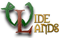
fraang Topic Opener
Joined: 2010-02-15, 13:13
Posts: 239 Widelands-Forum-Junkie |
Posted at: 2010-12-29, 23:04
Next try:
I would suggest one of the little worker graphics for the icon. I think this would look really cool. Edited: 2010-12-29, 23:06
Top
Quote
|
|
kingcreole
Joined: 2010-12-18, 12:13
Posts: 93  Likes to be here Location: germany |
Posted at: 2010-12-29, 23:19
looks just widelandish enough ^^ and that 3d-look makes it a little more... well... spicy, lovin it ^^ live is my dancefloor as long as my lag works
Top
Quote
|
|
SirVer
Joined: 2009-02-19, 15:18
Posts: 1440 One Elder of Players Location: Germany - Munich |
Posted at: 2010-12-30, 17:13
Very good way of presenting it! I like it also , the only thing that looks a bit strange is the "NDS" in the first logo that fades to a darker dark (shadow?). That somehow catches my eyes. Great work!
Top
Quote
|
|
fraang Topic Opener
Joined: 2010-02-15, 13:13
Posts: 239 Widelands-Forum-Junkie |
Posted at: 2010-12-30, 18:00
I thought it would make it easier to read. It seperates it from the "ide".
Top
Quote
|
|
chuckw
Joined: 2010-03-15, 16:23
Posts: 945 One Elder of Players Location: New York - USA |
Posted at: 2010-12-30, 19:30
Yes, fraang, I like it, too. If you wish to use the shading on the "NDS", let's make it consistent and shade the "A", as well. Nice work! Now to put them to use. How is the barbarian Coat of Arms coming along? That IS the topic of this thread after all. I see little people.
Top
Quote
|


 Do you have a Launchpad account? If not, take a look at the "GettingStarted" wiki page.