Topic: Build helper - icons
|
fraang Topic Opener |
Posted at: 2011-02-13, 23:49
Ok I start for this now a new tread. Here an ortho rendered version of the icons. The resolution is 256 x 256 pixels. Road: http://img831.imageshack.us/i/256bhroad.png/ Small building: http://img19.imageshack.us/i/256bhsmall.png/ Medium building: http://img443.imageshack.us/i/256bhmedium.png/ Large Building: http://img256.imageshack.us/i/256bhlarge.png/ Damn it! You have now to sign up to get the direct links. I have to look for anohter image hoster. Edited: 2011-02-13, 23:52
 Top
Top
 Quote
Quote
|
|
martin |
Posted at: 2011-02-14, 13:55
Your build helper icons look nice :) Are they intended to replace the old, flat ones?  Top
Top
 Quote
Quote
|
|
smoku |
Posted at: 2011-02-14, 14:17
I especially like the matt (non-glossy) texture.  Top
Top
 Quote
Quote
|
|
kingcreole |
Posted at: 2011-02-14, 14:38
coool live is my dancefloor as long as my lag works  Top
Top
 Quote
Quote
|
|
kingcreole |
Posted at: 2011-02-14, 14:45
maybe toonshader? i dunno how you did it but it looks great (pls tell me !!!) live is my dancefloor as long as my lag works  Top
Top
 Quote
Quote
|
|
SirVer |
Posted at: 2011-02-14, 15:57
I like these a lot. Only two nitpicks: the green house (big building) has a strange stripes on its roof. Might be shadows from the pinnacles. And I am not overfond of the brown of the flag; I also think flags will be hard to see with those. I suggest sticking to the yellow which stands out. Very nice work! Can't wait to see them in game.  Top
Top
 Quote
Quote
|
|
chuckw |
Posted at: 2011-02-14, 16:48
I, too, find your build help symbols very attractive. Could you post them in the scale they will be seen in the game?
I think scaling them down to game size will minimize the shadow effect on the roof, but I'd like to see it to be sure.
I agree. Try a color that will stand out more from the background (Builders and surveyors use yellow or orange for just that reason.) If we animate the set_flag markers, I think we should scale them even smaller than their current size of 38x42 in the game, again lest they cause too much distraction. AFAIK, animating the set_flags will require some new program coding, too. Very nice work! Let's see them scaled to the game. I see little people.  Top
Top
 Quote
Quote
|
|
fraang Topic Opener |
Posted at: 2011-02-14, 19:24
@martin Yes if I got it right it is planned to replace them. @kingcreole No I have used the standart shader of blender. But with raytracing and ambient occlusion. I would not animate it because it should be a helper to plan your buildings not a part of the living wide lands. I have pushed all in a bazaar branch (including the blend file): ~florian-angermeier/widelands-media/widelands-build-helper-icons Edited: 2011-02-14, 19:25
 Top
Top
 Quote
Quote
|
|
chuckw |
Posted at: 2011-02-14, 21:07
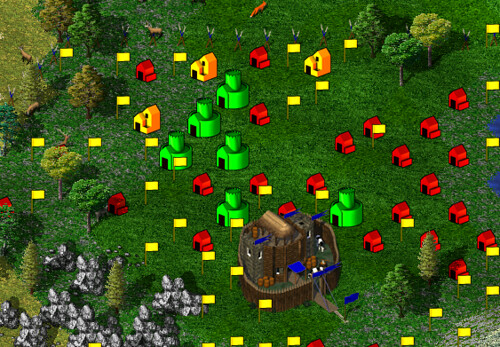
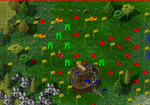
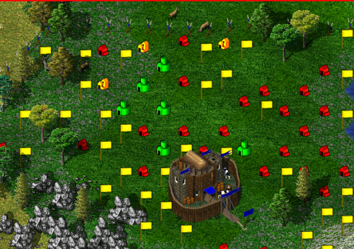
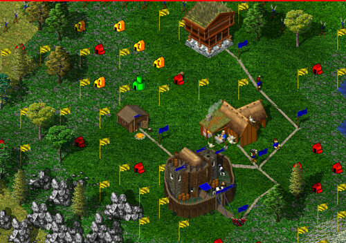
To help us get a little perspective from which to judge, here are some examples as seen from the game: Edit: added reference numbers for images to make discussion easier Edited: 2011-02-14, 21:09
I see little people.  Top
Top
 Quote
Quote
|
|
fraang Topic Opener |
Posted at: 2011-02-14, 22:10
I have tweaked the road and the large building icons (and pushed to the branch): Road: I hope the flag is now more consistent. Large building: It is now a bit smaller. Feedback is welcome.  Top
Top
 Quote
Quote
|


 But not so bright a shade that it will distract.


