Topic: Just in case... alternative Soldiers' skill icons for true inter-tribe comparison.
|
Astuur Topic Opener |
Posted at: 2011-10-30, 13:51
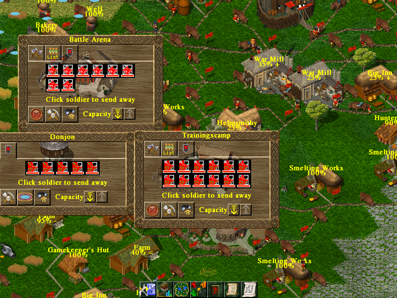
I don't think that a solution for addressing soldiers by skill will be focussing After much testing for visibility and recognizability I may have found a way. I have redesigned the four quadrants (Attack, Defense, Evade & Healthpoints) I have set the percentage for the highest value achievable in the game to be 100%. Since our little icons are 10 by 10 pixels, I have one pixel for each percent. Combined together in the game they look like this: I am not very fond of the solution I found. Edited: 2011-10-30, 13:54
Being no programmer, I apologize for all my suggestions that imply undue workload and for other misjudgements due to lack of expertise or relevant skills.  Top
Top
 Quote
Quote
|
|
pyaehtetaung |
Posted at: 2011-10-30, 18:16
not best!. But good looking. no problem for playing. Edited: 2011-11-01, 06:42
 Top
Top
 Quote
Quote
|
|
hjd |
Posted at: 2011-10-30, 19:00
I didn't know they were called Kiviat diagrams, but I think using it is a good idea. With the current colors though, it doesn't work. Though I do disagree with how you have calculated 100% / full image. I think it would make more sense that max trained for the tribe in question would give a fully colored skill, rather than only partially filled since some other tribe has a larger maximum. While I can understand why you chose to do it this way, it is both confusing ("why isn't it full? Is there any way to train my soldiers more?") and also it is how trained the soldier is based on the current tribe that matters, not other tribes I am currently not playing. IMO, an Empire soldier with attack 4 and a barbarian one with attack 5 should both be considered 100% trained and fully colored, as neither will be able to improve their attack skill anymore. Also, next time please calm down on the picture size. Ships!  Top
Top
 Quote
Quote
|
|
samithdisal |
Posted at: 2011-10-30, 20:23
hmmmm I see bit hard to look. Maybe we can highlight the current way of showing the status a lil more. Maybe like putting colours to the percentage. For an example 0-25 black 25-50 green 50-75 blue 75-99 red 100 while/gold NoOb KiWwaTa NoOb Ma NeWeI  Top
Top
 Quote
Quote
|
|
Astuur Topic Opener |
Posted at: 2011-10-31, 08:48
@hjd: As for th picture size, yes, the font is too big, but I wanted to show each pixel clearly in this case. Being no programmer, I apologize for all my suggestions that imply undue workload and for other misjudgements due to lack of expertise or relevant skills.  Top
Top
 Quote
Quote
|
|
Astuur Topic Opener |
Posted at: 2011-10-31, 08:55
@ samithdisal Being no programmer, I apologize for all my suggestions that imply undue workload and for other misjudgements due to lack of expertise or relevant skills.  Top
Top
 Quote
Quote
|
|
Personal_Joke |
Posted at: 2011-11-01, 01:17
If you could alter the colours used to make it easier to "read" I personally think it's a good idea and could be implemented. Maybe you could add an option ingame to choose between the original soldier upgrade images and Astuur's version?  Top
Top
 Quote
Quote
|
|
Astuur Topic Opener |
Posted at: 2011-11-26, 19:02
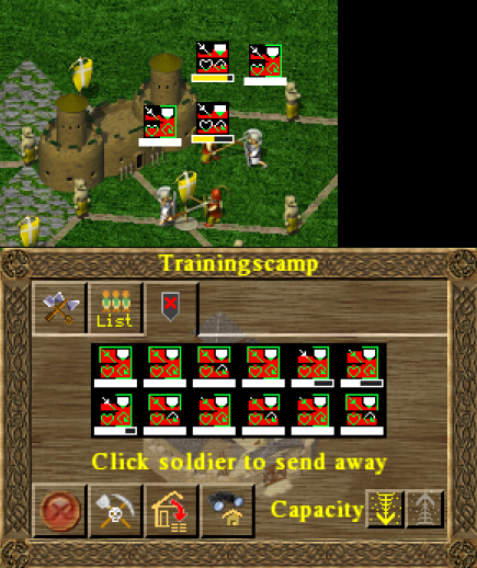
After many more attempts I've come to the conclusion that simplest might be best, after all. This is my current favourite, tested in game.
Like all others, it's a bit hard to see at screen resolution like 1900x1200 on 24", but not bad at up to 1200 or so. Explanation:
This is currently the end of this attempt, as I feel it doesn't get much better than that. This doesn't mean that better solution may not be found be someone else, of course. Chuck, please make up you mind whether you want to store this in some repository for a possible further use, if ever the "levels" are abondoned and inter tribe comparison is wanted. The files are here If anyone wants to try them out in his installation, you can download the rar archive and unpack it in /Widelands. It should overwrite the old files. Being no programmer, I apologize for all my suggestions that imply undue workload and for other misjudgements due to lack of expertise or relevant skills.  Top
Top
 Quote
Quote
|
|
ixprefect |
Posted at: 2011-11-29, 11:23
Please don't do red on green, that's hell for colorblind people (and I personally find it visually jarring).  Top
Top
 Quote
Quote
|
|
Astuur Topic Opener |
Posted at: 2011-11-29, 13:22
For most people it should be very well visible with complementary colours and for the colourblind there is a different grey value and it should not be
bad either. Being no programmer, I apologize for all my suggestions that imply undue workload and for other misjudgements due to lack of expertise or relevant skills.  Top
Top
 Quote
Quote
|


