Topic: Atlantean Campaign Graphics
|
chuckw Topic Opener |
Posted at: 2010-11-11, 23:16
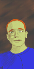
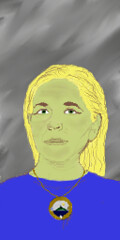
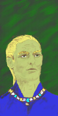
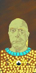
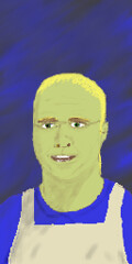
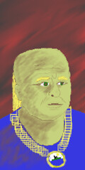
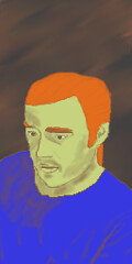
Another round of trial images: How about these? I've tried to sufficiently alter those that may pose a problem. Technically these are all original works, created from scratch. No copyrighted material has been electronically or digitally reproduced. I would argue that with my talent nothing would be recognizable. Take that how you will. Comments? Edited: 2010-11-12, 06:35
I see little people.  Top
Top
 Quote
Quote
|
|
SirVer |
Posted at: 2010-11-12, 11:20
I can recognize Galadriel and myself (though Kristin didn't recognize me in Ostur Chuck, please change Ostur as well. I am not feeling good with my face in the game for the following reasons: other developers have totally owned the right to be in the game then as well and I do not like to break the fourth wall because I think the feeling of the game will be harder to maintain. Also, I am kinda shy. I feel flattered that you picked me though Edited: 2010-11-12, 11:20
 Top
Top
 Quote
Quote
|
|
chuckw Topic Opener |
Posted at: 2010-11-12, 14:42
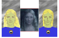
I will certainly comply with your request to change the Ostur image. But I like the Jundlina image so much that I present a side-by-side comparison of my original sketch, the photograph I modeled it from and the altered sketch. In showing you this I may risk indelibly etching the connection in your mind, but if after seeing these you still want it changed, I will (reluctantly) change it. I read once that there is a "golden" triangle which is common in faces we find attractive. It is the ratio of the distance between the eyes and their relationship to the nose and mouth. While the actual measurements will differ between individuals (that difference is even used in computer face recognition for example), the ratio will be surprisingly similar. Here is my Exhibit "A":
Beauty, as they say, is in the eye of the beholder, and also I guess is the impression of similarity. However, ultimately "your wish is my command" and I will comply with it. So what do you think? I see little people.  Top
Top
 Quote
Quote
|
|
chuckw Topic Opener |
Posted at: 2010-11-12, 18:50
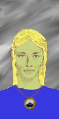
How about these alternatives? Edited: 2010-11-12, 19:59
I see little people.  Top
Top
 Quote
Quote
|
|
SirVer |
Posted at: 2010-11-13, 00:18
About your exhibit a): One can clearly see the change Jundlina went through, the second version is indeed very much how I imagine her to look; hard, determined and a bit bitter. But the eyes of galadriel and her eye brows are still very recognizable (imho). So I prefer the new Jundlina; she also has a demanding look in her eyes and no one will talk up to her if she does not so desire. So I vote for the new Jundlina as she feels more original to me. Ostur is looking very good... I have a speculation where his idea comes from though. Could he have spent some time on another kind of ship in a quite distant future? Update: I just checked this again, he was maybe not on a ship but on a station in the distinct future. Could I be right? Edited: 2010-11-13, 00:20
 Top
Top
 Quote
Quote
|
|
chuckw Topic Opener |
Posted at: 2010-11-13, 01:59
So be it. I may be able to "harden" her up a bit, too.
You may be seeing someone whom I did not place there. No. This Ostur model is another original invention of mine. I don't think I'm quite done with him yet either. In fact, I noticed these portraits should be moved up some in their frames to get a full head shot when the page first loads. Jundlina could only be seen from her chin up in the first scene of her memoirs. So I will push another set of tweaks with the characters standing taller in their portraits. Continuing on this theme of 2D art, I've been thinking about some graphics for the opening texts. They seem so lonely on the stark black screen. Perhaps keeping the black background and put a cameo scene on each side of the text box on the screen for a graphical depiction of the narrative. For example: Title - "Proudest to the death" - Left side cameo depicts an island like the image on the Atlantean seal only in more realism. Right side cameo depicts King Ajanthul rising from the sea or King Ashkandor consulting the clerics. Title - "The god's disgrace" - Left side cameo depicts perhaps the disturbed horses while the right side shows the flooding near the horse stables. Title - "Uproar and confusion" - Left side cameo shows worried people one perhaps leading a sheep or horse to an altar (no blood). The right side cameo could show a temple in flames with Jundlina holding a torch. These are my thoughts. I'm not sure how well I can turn them into graphics, but I'm willing to try. What do the rest of you think? I see little people.  Top
Top
 Quote
Quote
|
|
SirVer |
Posted at: 2010-11-13, 11:24
such graphics would be very cool indead; I could think of them like they are taken from the same book/stone carvings or whatever. Have you ever seen the movie shrek? It starts out with "once upon a time" that some one reads in a book, each sentence get's it's own page including a graphic and the last page fades over into reality. I really liked the effect; it gave the pre-story the right story tale feeling. Maybe we could get the same feeling with oldish history books like drawings. Just my 2p, run with whatever you feel most comfortable. Also other things are probably higher priority for build 16, I think there are still some concept graphics lurking around (for example the graphic to visualize the selection of a ware in the warehouse). I'd love such graphics though...  Top
Top
 Quote
Quote
|
|
chuckw Topic Opener |
Posted at: 2010-11-13, 15:32
Good ideas. And yes, I know what you are saying about the Shrek movie.
I'm not sure I know what you are referring to by "visualize the selection of a ware", but I'd look into it if you could help me understand what you want. I'll put the Atlantean opening graphics on my Build 17 list then. I see little people.  Top
Top
 Quote
Quote
|
|
SirVer |
Posted at: 2010-11-14, 00:04
yes, sorry for the imprecision. Have a look at pics/ware_list_bg_selected.png; this is the graphic used to highlight which wares are selected in the warehouse window (click on a warehouse -> click on a ware). Hope that clears this up  Top
Top
 Quote
Quote
|
|
chuckw Topic Opener |
Posted at: 2010-11-14, 02:02
Ah, yes. I see little people.  Top
Top
 Quote
Quote
|


 ).
).
