Topic: Re-modelling Barbarian Buildings
|
chuckw Topic Opener |
Posted at: 2010-11-22, 19:46
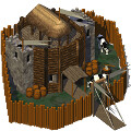
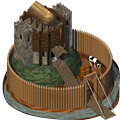
Hi! Even before becoming Graphics Elder I have been wanting to get 3D models for the tribal buildings that currently don't have one. The buildings in question are all from the barbarian tribe, the first and oldest tribe to be modeled. As such, there are some subtle differences in their appearance from the newer buildings that have come from an ever-evolving technique for rendering the models into 2D. But, in the course of getting the game onto its feet in those early days combined with an ever-changing group of graphicians, the original 3D models for some of the buildings have been lost to the mists of time. There are many reasons to have 3D models for every building in the game. For example, player color is difficult to add to a 2D image, not to mention how hard it would be to add animation! For starters, here are images of the barbarian headquarters: Now the recreated model is certainly subject for discussion, as are any of the graphics in the game. With a new 3D model in place, we now have greater opportunity to make modifications.
So I'd like you all to take a look at the buildings listed and give thought to how you might help out in this particular project. What do you think of my attempt with the headquarters building? (BTW it will be animated and have playercolor.) Please share your comments, ideas, etc. Edited: added link to Bug Report Edited: 2010-11-22, 19:50
I see little people.  Top
Top
 Quote
Quote
|
|
chuckw Topic Opener |
Posted at: 2010-11-22, 20:11
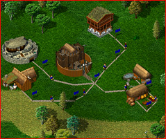
Now about the headquarters: Here is a screen grab to show the new graphic in context with other existing images.
I've used no stone and more burntwood because comments in the conf file state the use of burntwood in the towers. I also experimented with a moat around the stockade and even putting the building on top of a hill like the old motte and bailey castles, but opted to keep it simpler. What do you think? Edited: added comments about trying different objects in the scene Edited: 2010-11-22, 20:19
I see little people.  Top
Top
 Quote
Quote
|
|
SirVer |
Posted at: 2010-11-22, 20:13
I like the new model but I'd prefer it to have some stones. Also I think the palisade is a too perfect circle. It is a damn shame that we need to recreate all those models, I am sorry that you have to burden our past sloppiness :(.  Top
Top
 Quote
Quote
|
|
chuckw Topic Opener |
Posted at: 2010-11-22, 20:28
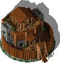
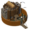
Here is an image of one of my earlier trials: I offer this as an example of using stonework to the same extent as the original HQ. @SirVer: Is this along the lines of your thinking? I see little people.  Top
Top
 Quote
Quote
|
|
SirVer |
Posted at: 2010-11-22, 20:51
i like the stone work, but your other image still looks much better because the buildings inside the ring is much bigger and there are fewer distractions....  Top
Top
 Quote
Quote
|
|
chuckw Topic Opener |
Posted at: 2010-11-22, 20:58
That's why I abandoned this one. I see little people.  Top
Top
 Quote
Quote
|
|
chuckw Topic Opener |
Posted at: 2010-11-22, 21:26
To everyone: Which is your favorite? I see little people.  Top
Top
 Quote
Quote
|
|
Fopper |
Posted at: 2010-11-22, 22:16
I pick B, it has more color in it. But I miss the real symbol (player color) that I would place on my headquarter. Would it be an idea to add a banner on the front side of the building in the player color and with a symbol on it? I do think player color should be used minimalistic on other buildings, but on your headquarter you might expect some extra.  Top
Top
 Quote
Quote
|
|
SirVer |
Posted at: 2010-11-22, 22:42
B!! I als want a lot of player colors  Top
Top
 Quote
Quote
|
|
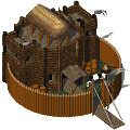
chuckw Topic Opener |
Posted at: 2010-11-22, 22:48
How is this? Remember the pennants are playercolor. (They appear gray in this image.) I see little people.  Top
Top
 Quote
Quote
|


 So I have started to recreate the buildings in 3D where needed.



 but on all buildings, not only on my HQ.