chuckw

Topic Opener
Joined: 2010-03-15, 16:23
Posts: 945
 One Elder of Players
Location:
 New York - USA
|
Posted at: 2011-09-21, 21:48
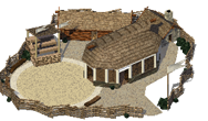
With the "success" of the new trainingscamp  in using more of the real estate that is available to big buildings, I've started work to apply the same strategy to the battlearena. in using more of the real estate that is available to big buildings, I've started work to apply the same strategy to the battlearena.
Here is the current battlearena:  and here is where the remake currently stands: and here is where the remake currently stands: 
I see little people.
 Top
Top
 Quote
Quote
|
|
|
chuckw

Topic Opener
Joined: 2010-03-15, 16:23
Posts: 945
 One Elder of Players
Location:
 New York - USA
|
Posted at: 2011-09-21, 21:55
The rail fence in the working model demarks the limit before being impacted by the z-layering problem.
There are obvious similarities between the trainingscamp and this rework, but that is intentional. The roof of the mainbuilding still needs the material applied. That will be fixed. 
I'm considering repositioning the main building by rotating it 90 degrees and placing the front door at the near corner. That should free up enough space in the southwest of the plot to move the arena to the foreground and maintain more of the current building's layout. I'll post an image of that when I get it put together.
Comments?
I see little people.
 Top
Top
 Quote
Quote
|
|
|
chuckw

Topic Opener
Joined: 2010-03-15, 16:23
Posts: 945
 One Elder of Players
Location:
 New York - USA
|
Posted at: 2011-09-21, 22:21
This is what I was trying to describe above. The red panel indicates where I plan to place the front door (i.e. the hot spot.)
battlearena2: 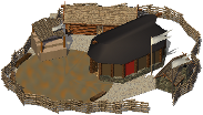
I am actually favoring this approach.
EDIT - A hot spot of 116 81 can be used to test either image in the game.
Comments and suggestions are always welcome.
Edited: 2011-09-21, 22:23
I see little people.
 Top
Top
 Quote
Quote
|
|
|
chuckw

Topic Opener
Joined: 2010-03-15, 16:23
Posts: 945
 One Elder of Players
Location:
 New York - USA
|
Posted at: 2011-09-22, 01:51
Here is the building I am proposing to replace the current battlearena:
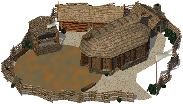
A hot spot of 117 70 will place it properly in the game if you wish to try it out.
Comments?
I see little people.
 Top
Top
 Quote
Quote
|
|
|
Astuur

Joined: 2009-02-28, 10:08
Posts: 733
 One Elder of Players
Location:
 Frankfurt / Germany
|
Posted at: 2011-09-22, 07:27
I cannot try them out right now in game, but will do so after work today.
Just from looking at it here, I don't really favor one of the two possibilities of the general space usage. The both have their pros and cons.
The first "working" model would offer ample space for a flag ceremonie and I also like the "gate keeper" hut.
Your last one also allows this, but only because the little hut has disappeared.
(the "shadow" in this place means the underlying terrain is visible, right?)
But of course the view into the arena itsself is unbeatable with the last proposition.
As for the latter: the little hut in the north east looks too squeezed into this place.
It may be a good idea to give that up in favor of something smaller; a tree, or a well maybe.
For the seats of the spectators a pent roof (had to look that up, hope the word is right) seems better. It would allow a better look onto the seats.
If you go with your favored model, it will be quite similar to the trainingscamp in regard to the placement of the main building.
In order to allow recognition at first glance, how about choosing some lighter material for the floor of the arena?
I would probably try sand in the there of a very light color
(like wüste1 terrain). This should also give a better background contrast for any sort of activity that might be going on later in this region.
In any case, both version will drag an old problem into the spotlight:
Often you are able to build "big" buidings near a flat coastline, so that they are partly erected on former water surface. That will look strange, if "ocean" tiles look through within the perimeter of the camps.
The programmers may need to find another solution there in any case.
I think this may end up solving the "attacking soldiers blocked by building"-bug at the same time. But that should not keep you from using all the space allowed  .
More later today, I hope... .
More later today, I hope...
Being no programmer, I apologize for all my suggestions that imply undue workload and for other misjudgements due to lack of expertise or relevant skills.
I am on Win32, have no means to compile, and rely on prefabricated distributions (Thanks to Tino).
 Top
Top
 Quote
Quote
|
|
|
SirVer
Joined: 2009-02-19, 15:18
Posts: 1440
 One Elder of Players
Location:
 Germany - Munich
|
Posted at: 2011-09-22, 09:39
Heya... haven't chimed in here for a looong time. This is a good sign obviously :P.
I love the new style of buildings and also their size, they in fact look like "big" buildings now. However, the battle arena and the trainingscamp must be clearly distinguishable, in this regard, I prefer the second approach, however an even clearer distinct look with maybe more stones or something else of different color would even be better imho. Also, I'd like to see more player color on the huge building. As always, those are just my 2ç. It is great to see how fast widelands is improving graphics wise. Thanks chuck!
 Top
Top
 Quote
Quote
|
|
|
chuckw

Topic Opener
Joined: 2010-03-15, 16:23
Posts: 945
 One Elder of Players
Location:
 New York - USA
|
Posted at: 2011-09-22, 16:44
Taking your comments into consideration, I offer what I am calling BA3  : :

I have changed the roof on the viewing stand to a "pent" or "shed" roof to give a better view of the seats which I have treated with a different material.
The arena floor has been resurfaced with a sand material and a transparent rim.
The stone building has a lighter color, but remains tucked away to the north for now. I am still undecided about repositioning it to the gate and lose the possibilities for future animation in the foreground. We'll see.
Oh, and is this enough PlayerColor, for you, SirVer? 
If you wish to try this out in a game for yourself, here are the images you'll need to invoke PlayerColor. A hot spot of 112 75 should place it well:
 
What do you think?
EDIT - adjusted the hot spot
Edited: 2011-09-22, 16:53
I see little people.
 Top
Top
 Quote
Quote
|
|
|
chuckw

Topic Opener
Joined: 2010-03-15, 16:23
Posts: 945
 One Elder of Players
Location:
 New York - USA
|
Posted at: 2011-09-22, 20:28
Two more variations:
BA4:    hot spot 112 75 hot spot 112 75
BA5:    hot spot 116 74 hot spot 116 74
In BA4, I returned the stone building to the gate and elongated log lodge.
In BA5, keeping the stone building at the gate, I rotated the main building, moved the log lodge and added an extra structure at the north fence that I thought might be appreciated come time to add some animation. 
What do you think of these?
I see little people.
 Top
Top
 Quote
Quote
|
|
|
Astuur

Joined: 2009-02-28, 10:08
Posts: 733
 One Elder of Players
Location:
 Frankfurt / Germany
|
Posted at: 2011-09-22, 20:37
Very nice!
The semi-transparent ring is a great idea!
Maybe it could even be a bit more transparent?
Finished otherwise, I'd say.
Just one more thing, Chuck: I find it a bit irritating how the fence on the north melts
with the roof. Maybe some change of color or even a thached roof could be an answer,
or just make that part of the fence less high to let it completely vanish behind the building.
I am still undecided about repositioning it to the gate and lose the possibilities for future animation in the foreground. We'll see.
Why should you want this? I can see no benefit at all from doing so. The space behind the central building is lost for all else.
Please notice the problem with the fully transparent ground and the ocean.
This is what I was trying to hint at in my last post.

Being no programmer, I apologize for all my suggestions that imply undue workload and for other misjudgements due to lack of expertise or relevant skills.
I am on Win32, have no means to compile, and rely on prefabricated distributions (Thanks to Tino).
 Top
Top
 Quote
Quote
|
|
|
chuckw

Topic Opener
Joined: 2010-03-15, 16:23
Posts: 945
 One Elder of Players
Location:
 New York - USA
|
Posted at: 2011-09-22, 20:49
Astuur wrote:
Very nice!
The semi-transparent ring is a great idea!
Maybe it could even be a bit more transparent?
I'll play with it.
Finished otherwise, I'd say.
Just one more thing, Chuck: I find it a bit irritating how the fence on the north melts
with the roof. Maybe some change of color or even a thached roof could be an answer,
or just make that part of the fence less high to let it completely vanish behind the building.
Check BA5. Otherwise, if one of the other versions is desired, I'll do something about the fence in the north.
I am still undecided about repositioning it to the gate and lose the possibilities for future animation in the foreground. We'll see.
Why should you want this? I can see no benefit at all from doing so. The space behind the central building is lost for all else.
Please notice the problem with the fully transparent ground and the ocean.
This is what I was trying to hint at in my last post.
It sometimes takes a couple "nudges" for me to comprehend.  I thought it would be nice to see the natural terrain within the perimeter. I now understand the issue and will take steps to address it. Thanks. I thought it would be nice to see the natural terrain within the perimeter. I now understand the issue and will take steps to address it. Thanks.
I see little people.
 Top
Top
 Quote
Quote
|
 Top
Top
 Quote
Quote
 Top
Top
 Quote
Quote
 Top
Top
 Quote
Quote
 Top
Top
 Quote
Quote
 Top
Top
 Quote
Quote
 Top
Top
 Quote
Quote
 Top
Top
 Quote
Quote
 Top
Top
 Quote
Quote
 Top
Top
 Quote
Quote
 Top
Top
 Quote
Quote


 .
More later today, I hope...
