Topic: Main Menu Redesign
|
Nordfriese Topic Opener |
Posted at: 2020-08-08, 20:02
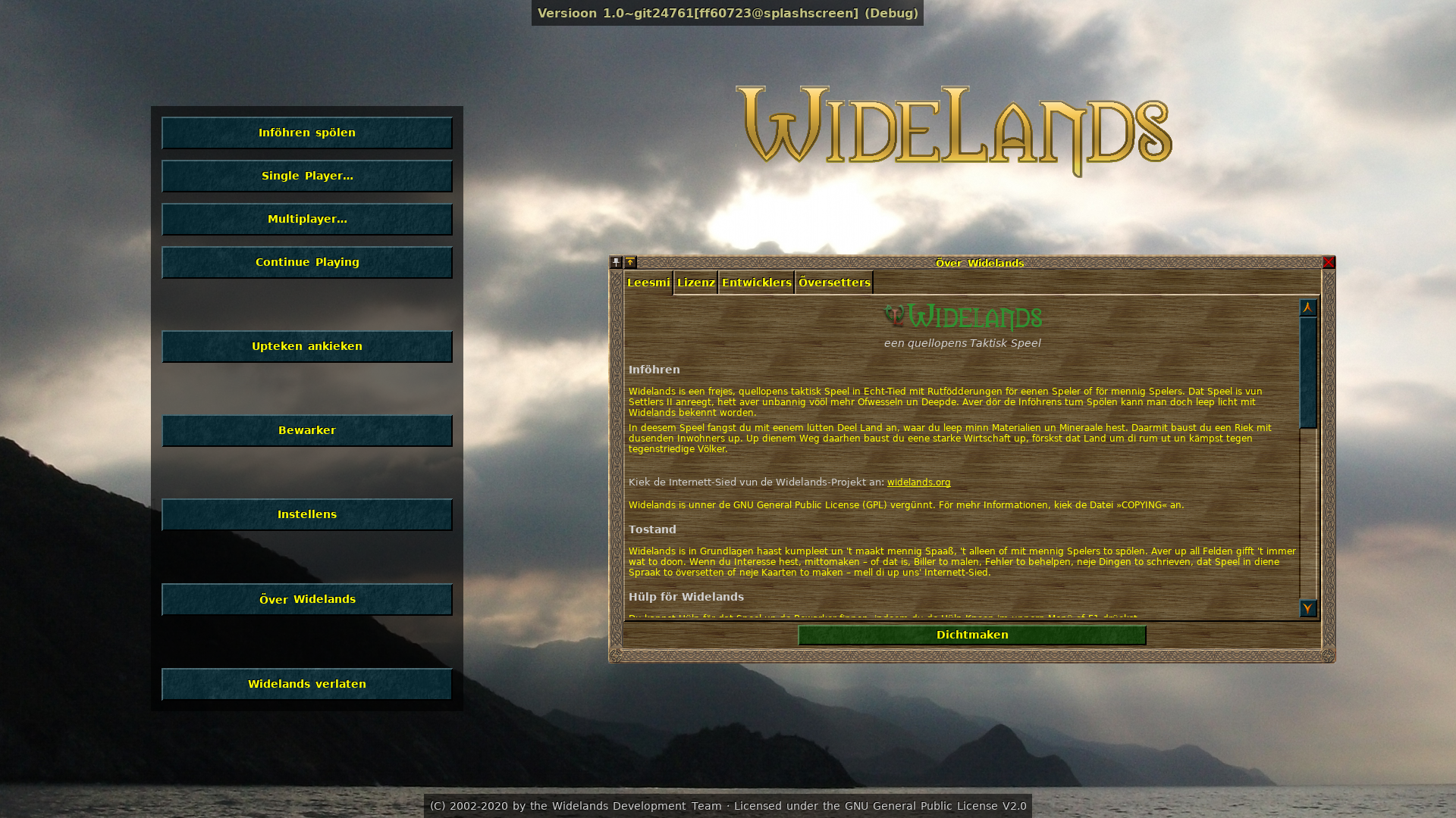
There is some discussion about getting rid of the splash screen (the one with the setting sun and the big Widelands logo) and redesigning the main menu. My suggestion: Here, the sunset image is initially overlayed over the screen and automatically fades smoothly into the main menu with the new animated image gallery slides. (The slides on the left reintroduce the old loading screens; the ones on the right show miscellaneous in-game scenes – the ones in the example above are not good (because too small), appropriate screenshots would still have to be taken.) (It is still possible to skip the animation and go straight to the menu by pressing any key or clicking of course.) Opinions?  Top
Top
 Quote
Quote
|
|
Nordfriese Topic Opener |
Posted at: 2020-08-09, 17:25
Alternative suggestion: (a single large background image that is exchanged slowly and smoothly every ten seconds)  Top
Top
 Quote
Quote
|
|
kaputtnik |
Posted at: 2020-08-09, 20:01
Much better, imho The single elements (button-section, logo and about window) are visually floating around without any conjunction though. I feel this a bit disturbing... If feasiblle let the logo start at the same vertical position as the background of button-section, and let the about window start at the bottom of the button-section. Then there will be more clarity for a human eye (and his brain).  Top
Top
 Quote
Quote
|
|
Nordfriese Topic Opener |
Posted at: 2020-08-09, 20:06
The about window is now a window, which is centered by default and can be moved around like all other windows Like this? Edited: 2020-08-09, 20:07
 Top
Top
 Quote
Quote
|
hessenfarmer
|
Posted at: 2020-08-09, 20:37
well how does it look in 800x600 res?  Top
Top
 Quote
Quote
|
|
GunChleoc |
Posted at: 2020-08-09, 20:39
I like the basic design The logo still looks a bit lonely though, we need a better spot for it. Edited: 2020-08-09, 20:39
Busy indexing nil values  Top
Top
 Quote
Quote
|
|
Nordfriese Topic Opener |
Posted at: 2020-08-09, 20:39
Hm, how about using the loadingtips banner or something like that as a background? Edited: 2020-08-09, 20:41
 Top
Top
 Quote
Quote
|
|
Nordfriese Topic Opener |
Posted at: 2020-08-09, 20:51
Suggestion Edited: 2020-08-09, 20:51
 Top
Top
 Quote
Quote
|
|
kaputtnik |
Posted at: 2020-08-10, 08:16
Too many colors, imho. What about this mockup: Logo starts at left edge, give the logo the same background as the menu has and let the background of the menu end at the background of the logo. The background is like an upside down 'L'. Can we have the leaves from the old menu as a border? Edited: 2020-08-10, 08:17
 Top
Top
 Quote
Quote
|
hessenfarmer
|
Posted at: 2020-08-10, 11:15
I like this design. However I'd suggest to have the Widelands logo in the top middle and two columns below with the options to play on the left and the other options on the right. And the leaves at the border would be nice as well Edit: maybe the height of the roll surrounding the logo could be reduced a bit Edited: 2020-08-10, 11:18
 Top
Top
 Quote
Quote
|


